Components, general
Every story of every component at the top of `mantra_starter/components` -- the pieces that are not tied to one part of the page: the branding, the buttons, the cards and the grid they sit in, headings, links, the pager, the search box, tables, tags and the rest. The component library at `/ui-components` is still the place to read one component, with its props and its schema; this is the page that puts them next to each other, in the theme, at the width the theme serves. Nothing here is authored: each block is a `*.story.yml` committed beside its component, so the page and the library cannot disagree. Every story is made up and nothing is saved.
Branding
Site name, logo, slogan.
Name and slogan only
A site with no logo uploaded. Each of the three parts is printed only when it has a value, so this is the case where the name has to carry the navbar on its own.
Default
Logo only
The name and the slogan turned off in the site branding block, which is what a site whose logo carries the name does.

Button
Buttons allow the user to take actions or make choices.
Icon left
Long label
A label long enough to wrap, to check padding and line height.
Disabled
Default
LabelButton element
Without a URL the component renders a rather than a link.
Large
Large buttonSmall
Small buttonCard
Web Development
Card carrying only content, with no image, title or caption.
Card Grid
Bikes
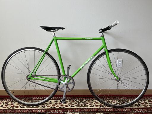
The first three rows of the Bikes grid view (retrograde site, /bikes).
Topics
Content-only cards, to show the grid without images.
Details
Dropdown details element.
Details
Click me
Details
Click me
Drupal logo
Retro logo with color variables. Without a style, it follows the "Drupal logo" UI Skins theme selected in the theme settings.
Rockstar
Gold drop, top hat, shades. Both accessories at their defaults, through the `hat` and `glasses` props -- which is all it takes when the default placement and palette are what you want.
Royal
A crown and heart glasses, with the hearts tinted rather than left open.
Wizard
Synthwave, a wizard hat pulled down over the drop's eyes, and a monocle under it. `y` and `scale` on the hat are a transform about the middle of its band, so the hat grows and drops without its drawing changing.
Deal with it
Pixel glasses and a santa hat, both nudged with the placement props: the glasses sit low and the hat is pushed off to one side.
Winter
A bobble hat and round glasses over the night sky. The hat is recolored through the `accessories` slot rather than the `hat` prop, which is the one way to reach an accessory's own props.
Birthday
Party hat and star glasses over the prism style.
Drupal logo glasses
Glasses for `mantra_starter:drupal_logo`, drawn in the logo's own coordinate space so that they land over the drop's eyes with no placement of their own. Use them through the logo's `glasses` prop, or hand them to the logo's `accessories` slot to set the props below.
mantra_starter:drupal_logo_glasses
Tinted
Star frames with a translucent lens. `lens` is the fill of the same path the frame strokes, so a color with alpha tints the logo's eyes instead of hiding them -- and `weight` thickens the frame without redrawing anything.
Default
The glasses on their own, in the box they are drawn for -- the same shape and viewBox as the logo, with the lenses over where its eyes are. To see them worn, use `mantra_starter:drupal_logo`'s `glasses` prop or its `accessories` slot.
Drupal logo hat
A hat for `mantra_starter:drupal_logo`, drawn in the logo's own coordinate space so that it lands on the drop's head with no placement of its own. Use it through the logo's `hat` prop, or hand it to the logo's `accessories` slot to set the props below.
mantra_starter:drupal_logo_hat
Recolored
A party hat in colors of its own. Each prop writes one CSS variable onto the group that carries the drawing, so a variable set further out -- a UI Skins theme, a page, a parent component -- still wins where a prop is left out.
Default
The hat on its own, in the box it is drawn for -- the same shape and viewBox as the logo, so the hat sits where it would sit on the drop's head. To see it worn, use `mantra_starter:drupal_logo`'s `hat` prop or its `accessories` slot.
Field
Default
A label and a body, which is the shape every field render array arrives in.
Gallery
Default
Three thumbnails. The row height comes from `field_thumbnail_height` on the paragraph the gallery is built from; there is no paragraph here, so the template falls back to its 12rem default.
Heading
Span
The default tag. A heading that looks like one but must not enter the document outline -- the label of a list, say -- is a span.
With classes
`heading_classes` is added to the element's attributes, so a caller can size a heading without the component knowing anything about the scale.
A heading rendered as h3, sized by its classes
Default
The tag is a prop rather than a fixed element, so the same component can sit at whatever level the surrounding document has reached.
A heading rendered as h2
Hero
Default
A background image with the content set over it. `title` and `url` are declared on the component but the template does not print them -- the heading and the link belong to whatever is placed in the content slot.
Built for the long way round
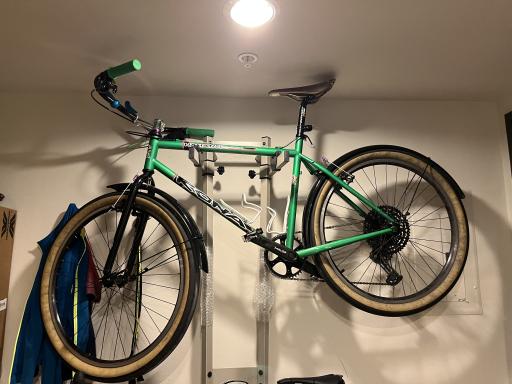
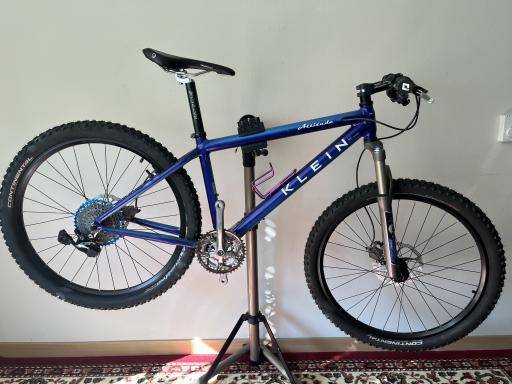
Frames, wheels and the parts that hold them together, chosen for roads that run out. See the bikes Klein Attitude, 1995Text only
No background image. The background element is still emitted, so this is the case to check that an empty one collapses rather than leaving a band of whitespace above the content.
Workshop hours
Tuesday to Saturday, nine until six. Repairs booked in by Thursday go out the same week.Link
Link examples.
Active
Hover
Visited
Default
Pager
Views pager.
First page
Four pages, sitting on the first. Previous and first are dropped, and so is the leading ellipsis -- the template hides first while the numbers already start at 1, so this is the case where the row must not open with a gap.
Default
Page 3 of 8, which is the only state that puts every item on the page at once: first and previous on the left, last and next on the right, an ellipsis either side of the numbers, and the current page marked. `current` and `ellipses` are set by template_preprocess_pager() rather than declared on the component, and they are what decides which of those items appear.
Teaser
Internal label and resource link.
Default
An internal label linked to the node it names, and the resource it points at printed as its own URL.
Unpublished
The same reference with `published` false. The template does not act on the prop today; this is the story to check against once it does.
Screenshot
Default
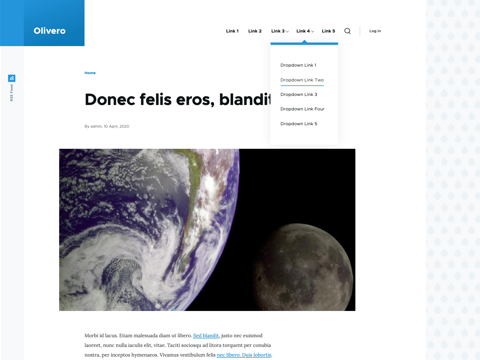
An image in the frame the theme puts around a screenshot. A real screenshot is used rather than a photograph, because the frame is what the component contributes and a photograph hides where it ends.
Search Box
Default
The form the site search block renders as. `key` is the query parameter the input is submitted under, so it has to match what the target route reads.
Swiper
Default
Three slides, the pagination, the two arrows and the scrollbar. The markup is what Swiper is initialised against; without its JavaScript running the slides simply stack, which is the state to check the unenhanced page in.
Swiper slide
Default
One slide on its own. The slide is a 16:9 box and the image is contained inside it, so a picture of any shape keeps every slide the same height.
Table
A table that carries the theme's column width roles. A role is declared once, on the column, and the component puts it on the header cell and on every body cell in that column -- which is the part that is tedious by hand and easy to get wrong, because auto layout sizes a column from the widest content in it, so a role on the header alone leaves a long body cell free to widen the column anyway. The table is wrapped in the scroll container, so it keeps its natural width and scrolls sideways rather than having its columns crushed.
Responsive columns
Core's responsive table option, declared per column. The last three columns are marked `low` and the summary `medium`, so a narrow window shows the component and its machine name alone, a medium one adds the summary, and only a wide one shows the lot. Narrow the window to see it: the columns leave the table rather than being scrolled to, and core adds a "Show all columns" toggle above the table to get them back. The toggle is stuck to the left edge of the scroll container, so it stays put when a wide table is scrolled sideways.
| Component | Machine name | Summary | Status | Stories | Operations |
|---|---|---|---|---|---|
| Card | card | An image, a heading and a short run of text, linked as a whole. | Experimental | 2 | Edit |
| Hero | hero | The first thing on a page: a heading, a paragraph and at most one call to action. | Experimental | 2 | Edit |
| Primary navigation | primary_nav | The menu of the site, which collapses into a toggle below the breakpoint. | Stable | 3 | Edit |
| Table | table | A table whose columns carry the theme's width roles. | Experimental | 4 | Edit |
Empty
No rows. The header is still printed, and `empty` fills a single cell spanning every column -- so a filter that matches nothing keeps the columns it was filtering rather than collapsing the table to one narrow cell.
| Component | Status | Operations |
|---|---|---|
| No components match the filter. | ||
Sticky header
The same table with `sticky` on. Scroll the *page*: the table keeps its full height and no scrollbar of its own, and the header is carried down the table by a script until the last row, where it stops. Scroll the table sideways while it is holding and the header goes with its own columns, which is the half a viewport-fixed header gets wrong.
| Component | Machine name | Status | Stories |
|---|---|---|---|
| Branding | branding | Stable | 1 |
| Button | button | Stable | 2 |
| Buttons demo | buttons_demo | Stable | 1 |
| Card | card | Experimental | 2 |
| Card grid | card_grid | Experimental | 2 |
| Content w/ sidebar | content_w_sidebar | Stable | 1 |
| Field | field | Stable | 1 |
| Gallery | gallery | Experimental | 1 |
| Heading | heading | Stable | 3 |
| Hero | hero | Experimental | 2 |
| Link | link | Stable | 4 |
| List | list | Stable | 1 |
| Menu | menu | Experimental | 2 |
| Pager | pager | Experimental | 2 |
| Primary nav | primary_nav | Stable | 3 |
| Reference | reference | Stable | 2 |
| Screenshot | screenshot | Stable | 1 |
| Search box | search_box | Experimental | 1 |
| Swiper | swiper | Experimental | 1 |
| Table | table | Experimental | 3 |
| Tabs | tabs | Experimental | 2 |
| Tag | tag | Stable | 1 |
Default
Every role at once: a shrink-wrapped check box column, a growing title, a prose column sized at 24 characters, a column that is empty in every row, and shrink-wrapped operations.
| Component | Summary | Operations | ||
|---|---|---|---|---|
| ☐ | Card | An image, a heading and a short run of text, linked as a whole. | Edit | |
| ☐ | Hero | The first thing on a page: a heading, a paragraph and at most one call to action. | Edit | |
| ☐ | Primary navigation | The menu of the site, which collapses into a toggle below the breakpoint. | Edit |