
Why it is installed
Provides the archive listing on the blog. Remove it together with the view.
ID: drupalorg_issues:issue_link
A link to a drupal.org issue: the logo of the tracker it lives on (drupal.org or GitLab) linking to it there, the issue number on the color of its status linking to the issue page, and the title linking to the annotation. Resolved issues (fixed or closed) are struck through, as drupal.org does.
Status: stable
| Name | Label | Type | Description |
|---|---|---|---|
label
|
Label | String | The issue title. Required |
url
|
URL | String | Where the title links to, the annotation when there is one. Required |
number_url
|
Number URL | String | Where the number links to, the issue page. Empty, or the same as url, makes number and title one link. |
number
|
Number | Number | The issue number, shown as "#123" on the color of the status before the title. 0 hides it, and a dot in that color stands in for it. Integers only |
status
|
Status | String | The status value: active, needs_work, needs_review, rtbc, patch_to_be_ported, fixed, postponed, postponed_info, closed_fixed, closed_duplicate, closed_wont_fix, closed_works_as_designed, closed_outdated, closed_cannot_reproduce or closed. |
status_group
|
Status group | Enum | What the shape of the number, or of the dot, and the fading of closed issues follow. The colors follow the status, as drupal.org's do. Allowed values: open, work, review, rtbc, fixed, postponed, closed |
status_label
|
Status label | String | The status as drupal.org words it, e.g. "Needs review". |
resolved
|
Resolved | Boolean | Fixed or closed. Strikes the title through. |
show_status_label
|
Show status label | Boolean | Print the status after the link. It is always in the tooltip and read to screen readers. |
tracker
|
Tracker | Enum | Where the issue lives. Empty hides the logo. Allowed values: , drupalorg, gitlab |
tracker_url
|
Tracker URL | String | The issue on drupal.org or GitLab. |
ID: drupalorg_modules:module_card
A module shown as a block: its module link, followed by the module rendered in a view mode of its own, such as its latest release, active installs and security coverage.
Status: stable
| Name | Label | Type | Description |
|---|---|---|---|
content
|
Content | Slot | The module, rendered in the view mode. |
label
|
Label | String | The link text, usually the module's title. Required |
url
|
URL | String | Where the label links to, the module's page on this site. Required |
project_url
|
Project URL | String | The module's project page on drupal.org, which the icon links to. Required |
machine_name
|
Machine name | String | The module's machine name, set as data-drupalorg-module on the link. |
view_mode
|
View mode | String | The view mode the module is rendered in, added as a class modifier. |
Latest release 8.x-1.14, 900,000 sites, covered by security advisories.
ID: drupalorg_modules:module_link
The Drupal drop linking to the module's project page on drupal.org, followed by a link to the module's page on this site.
Status: stable
| Name | Label | Type | Description |
|---|---|---|---|
label
|
Label | String | The link text, usually the module's title. Required |
url
|
URL | String | Where the label links to: the module's page on this site, or its project page on drupal.org for a viewer who may not see one. Required |
project_url
|
Project URL | String | The module's project page on drupal.org, which the icon links to. Required |
machine_name
|
Machine name | String | The module's machine name, set as data-drupalorg-module. |
installs
|
Active installs | Number | Sites using the module, as reported by drupal.org. Left out when not known. Integers only |
usage_url
|
Usage URL | String | The module's usage statistics on drupal.org, which the install count links to. |
security_covered
|
Security covered | Boolean | Whether the module has security advisory coverage, shown as a shield. |
ID: mantra_starter:button
Buttons allow the user to take actions or make choices.
| Name | Label | Type | Description |
|---|---|---|---|
label
|
Label | Slot | |
size
|
Size | Enum | It is possible to set the size of buttons. Allowed values: small, medium, large |
display
|
Display | Enum | Block buttons fill the width of their container. Allowed values: inline-block, block |
url
|
URL | Url | The button URL. Optional. |
icon
|
Icon | Unknown | ⚠️ {"properties":{"pack_id":{"type":"string"},"icon_id":{"type":"string"},"settings":{"type":"object"}},"type":"object"} |
icon_position
|
Icon position | Enum | Default: "right" Allowed values: left, right |
icon_only
|
Icon only? | Boolean | Show the icon alone. The label is kept for screen readers, so it still names the button. Has no effect without an icon. Default: false |
ID: mantra_examples:story_frame
A frame to show a story or an example in, at a container size and a zoom level of its own. The content is laid out at the width the frame is given -- and the frame is a size container, so container queries inside it answer to that width -- then scaled to the zoom level, so a desktop layout can be looked at whole on a narrow page. Media queries cannot be simulated this way: they keep answering to the browser window. A component that wants its narrow layout shown in the frame repeats its media query rules in a `@container story-frame-viewport (...)` query: the frame is always a container of that name, and no page outside a frame has one. Meant to be used in the `library_wrapper` of a story, with the story passed as the content slot.
Status: experimental
| Name | Label | Type | Description |
|---|---|---|---|
content
|
Content | Slot | The story or the example to show. |
label
|
Label | String | A caption for the frame, shown above it. |
width
|
Width | String | The inline size the content is laid out at, as a CSS length: `384px`, `48rem`, `60%`. Leave empty for the full width of the frame. |
height
|
Height | String | A fixed block size, as a CSS length. The content scrolls inside it. Leave empty to let the frame grow with its content. |
zoom
|
Zoom | Number | The scale the content is shown at: 1 is 100%, 0.5 is 50%. Default: 1 Minimum: 0.1 Maximum: 0.1 |
fit
|
Fit to width | Boolean | Zoom out as far as needed for the content to fit the width available, and never in. Takes precedence over the zoom level. Default: false |
container_name
|
Container name | String | A `container-name` for the frame beside `story-frame-viewport`, which it always has, for a component whose container queries name the container they answer to. |
controls
|
Controls | Boolean | Show the toolbar for changing the width and the zoom level. Default: true |
resizable
|
Resizable | Boolean | Show a handle on the inline end of the content for dragging its width, or moving it with the arrow keys once focused. A double click on the handle goes back to the full width. Default: true |
sizes
|
Sizes | List | The widths the toolbar offers, as CSS lengths. By default 256, 320, 384, 512, 640, 768, 1024 and 1440 pixels. |
ID: mantra_starter:branding
Site name, logo, slogan.
| Name | Label | Type | Description |
|---|---|---|---|
site_name
|
Site name | String | |
site_logo
|
Site logo | String | |
site_slogan
|
Site slogan | String |
ID: mantra_starter:card
Status: stable
| Name | Label | Type | Description |
|---|---|---|---|
image
|
Image | Slot | |
meta
|
Meta | Slot | |
content
|
Content | Slot | |
caption
|
Caption | Slot | |
title
|
Title | String | |
url
|
URL | String | |
aspect
|
Aspect ratio | Enum | Allowed values: 1-1, 2-1, 3-1, 4-1, 3-2 |
max_width
|
Max width | Enum | Allowed values: xs, sm, md, lg, xl |
center
|
Center | Boolean | |
padding
|
Padding | Enum | Allowed values: 1, 2, 3, 4 |
padding_x
|
Padding x | Enum | Allowed values: 1, 2, 3, 4 |
padding_y
|
Padding y | Enum | Allowed values: 1, 2, 3, 4 |
border
|
Border | Enum | Allowed values: 1, 2, 3, 4 |
ID: mantra_starter:card_grid
Status: experimental
| Name | Label | Type | Description |
|---|---|---|---|
rows
|
Rows | Slot | |
title
|
Title | String | |
gap_x
|
Gap x | Enum | Allowed values: 1, 2, 3, 4 |
gap_y
|
Gap y | Enum | Allowed values: 1, 2, 3, 4 |
ID: code_sample:code_sample_bare
Status: experimental
| Name | Label | Type | Description |
|---|---|---|---|
html
|
HTML | Slot | |
css
|
CSS | Slot | |
js
|
JS | Slot |
ID: code_sample:code_sample_display
Status: experimental
| Name | Label | Type | Description |
|---|---|---|---|
html_code
|
HTML code block | Slot | Replaces the plain <pre> the HTML is otherwise shown in, e.g. with a syntax-highlighted block. |
css_code
|
CSS code block | Slot | Replaces the plain <pre> the CSS is otherwise shown in. |
js_code
|
JS code block | Slot | Replaces the plain <pre> the JS is otherwise shown in. |
url
|
Url | String | |
title
|
Title | String |
ID: code_sample:code_sample_html
Status: experimental
| Name | Label | Type | Description |
|---|---|---|---|
title
|
Title | String | |
html
|
HTML | String | |
css
|
CSS | String | |
js
|
JS | String |
ID: code_sample:code_sample_iframe
Status: experimental
| Name | Label | Type | Description |
|---|---|---|---|
id
|
ID | String | |
title
|
Title | String |
ID: code_sample:code_sample_raw_html
Status: experimental
| Name | Label | Type | Description |
|---|---|---|---|
title
|
Title | String | |
html
|
HTML | String | |
css
|
CSS | String | |
js
|
JS | String |
ID: mantra_starter:container
Layout container.
Status: stable
| Name | Label | Type | Description |
|---|---|---|---|
content
|
Content | Slot | |
type
|
Type | Enum | Allowed values: block, flex, grid |
padding
|
Padding | Enum | Allowed values: sm, md, lg |
Content goes here
ID: mantra_starter:content_w_sidebar
Main column with a sidebar beside it. `meta` is the sidebar, and falls below the content once there is no room for a second column.
| Name | Label | Type | Description |
|---|---|---|---|
content
|
Content | Slot | |
meta
|
Sidebar | Slot |
ID: mantra_starter:details
Dropdown details element.
| Name | Label | Type | Description |
|---|---|---|---|
summary
|
Summary | Slot | |
content
|
Content | Slot | |
open
|
Open | Boolean | |
collapsible
|
Collapsible | Boolean | |
unstyled
|
Unstyled | Boolean | |
inline
|
inline | Boolean | |
details_classes
|
Details classes | List | Default: [] |
summary_classes
|
Summary classes | List | Default: [] |
summary_attributes
|
Summary attributes | Attributes | |
content_classes
|
Content classes | List | Default: [] |
content_attributes
|
Content attriubtes | Attributes |
1. Nothing to install. fullcalendar_view loads FullCalendar, moment, rrule and JSFrame from a CDN unless you host them yourself. fullcalendar needs the separate fullcalendar_io library.
2. Recurring events with no date module. You store an RRULE string in a plain long-text field, and can add an optional duration field (hh:mm). fullcalendar only handles repeating events through date_recur or Smart Date fields.
3. A separate mobile view. "Default mobile view" (for example listYear) takes over below a width you set (768px by default). fullcalendar has no setting for this.
4. A language picker for visitors. "Allow client to select language" puts a locale dropdown on the calendar. fullcalendar only follows the current Drupal language.
5. Opening an existing event in a modal, sidebar or new tab. Clicking an event can open it in a modal, the off-canvas sidebar or a new tab. fullcalendar's modal and settings-tray options only cover the form for creating an event.
6. Starting on the first result's date. The initial date can be "Date of first view result", as well as today or a fixed date.
7. Public holidays from Google Calendar, which you pick from a list and can show as background shading. fullcalendar can pull in any Google Calendar by ID, but has no holiday picker and no background option.
8. A Drush generator. The fullcalendarview_generator submodule has a command that builds calendar views for you.
9. Overriding the core logic. You can decorate the FullcalendarViewPreprocess service or write FullcalendarViewProcessor plugins. fullcalendar offers hooks (hook_fullcalendar_process_dates_alter, classes) and @FullcalendarOption plugins instead.
10. Older Drupal. It supports core from ^9.2. fullcalendar needs Drupal 10 or later.
1. Nothing to install. fullcalendar_view loads FullCalendar, moment, rrule and JSFrame from a CDN unless you host them yourself. fullcalendar needs the separate fullcalendar_io library.
2. Recurring events with no date module. You store an RRULE string in a plain long-text field, and can add an optional duration field (hh:mm). fullcalendar only handles repeating events through date_recur or Smart Date fields.
3. A separate mobile view. "Default mobile view" (for example listYear) takes over below a width you set (768px by default). fullcalendar has no setting for this.
4. A language picker for visitors. "Allow client to select language" puts a locale dropdown on the calendar. fullcalendar only follows the current Drupal language.
5. Opening an existing event in a modal, sidebar or new tab. Clicking an event can open it in a modal, the off-canvas sidebar or a new tab. fullcalendar's modal and settings-tray options only cover the form for creating an event.
6. Starting on the first result's date. The initial date can be "Date of first view result", as well as today or a fixed date.
7. Public holidays from Google Calendar, which you pick from a list and can show as background shading. fullcalendar can pull in any Google Calendar by ID, but has no holiday picker and no background option.
8. A Drush generator. The fullcalendarview_generator submodule has a command that builds calendar views for you.
9. Overriding the core logic. You can decorate the FullcalendarViewPreprocess service or write FullcalendarViewProcessor plugins. fullcalendar offers hooks (hook_fullcalendar_process_dates_alter, classes) and @FullcalendarOption plugins instead.
10. Older Drupal. It supports core from ^9.2. fullcalendar needs Drupal 10 or later.
1. Nothing to install. fullcalendar_view loads FullCalendar, moment, rrule and JSFrame from a CDN unless you host them yourself. fullcalendar needs the separate fullcalendar_io library.
2. Recurring events with no date module. You store an RRULE string in a plain long-text field, and can add an optional duration field (hh:mm). fullcalendar only handles repeating events through date_recur or Smart Date fields.
3. A separate mobile view. "Default mobile view" (for example listYear) takes over below a width you set (768px by default). fullcalendar has no setting for this.
4. A language picker for visitors. "Allow client to select language" puts a locale dropdown on the calendar. fullcalendar only follows the current Drupal language.
5. Opening an existing event in a modal, sidebar or new tab. Clicking an event can open it in a modal, the off-canvas sidebar or a new tab. fullcalendar's modal and settings-tray options only cover the form for creating an event.
6. Starting on the first result's date. The initial date can be "Date of first view result", as well as today or a fixed date.
7. Public holidays from Google Calendar, which you pick from a list and can show as background shading. fullcalendar can pull in any Google Calendar by ID, but has no holiday picker and no background option.
8. A Drush generator. The fullcalendarview_generator submodule has a command that builds calendar views for you.
9. Overriding the core logic. You can decorate the FullcalendarViewPreprocess service or write FullcalendarViewProcessor plugins. fullcalendar offers hooks (hook_fullcalendar_process_dates_alter, classes) and @FullcalendarOption plugins instead.
10. Older Drupal. It supports core from ^9.2. fullcalendar needs Drupal 10 or later.
ID: mantra_starter:drupal_logo
Retro logo with color variables. Without a style, it follows the "Drupal logo" UI Skins theme selected in the theme settings.
| Name | Label | Type | Description |
|---|---|---|---|
accessories
|
Accessories | Slot | Printed inside the logo's `<svg>`, on top of everything else, in the logo's own coordinate space -- so it takes SVG, not HTML. This is where to put `mantra_starter:drupal_logo_hat` or `mantra_starter:drupal_logo_glasses` with props of their own, or any other `<svg>` element drawn against a `0 0 681.167 778.583` viewBox. |
style
|
Style | Enum | Default: "default" Allowed values: default, sunset, synthwave, rainbow-eyes, prism, candy-stripe, polka-dot, gold, night-sky, blueprint, ghost |
hat
|
Hat | Enum | A hat from `mantra_starter:drupal_logo_hat`, at its default placement and palette. Use the `accessories` slot instead to set its own props. Allowed values: , top_hat, party, santa, beanie, wizard, crown |
glasses
|
Glasses | Enum | Glasses from `mantra_starter:drupal_logo_glasses`, at their default placement and palette. Use the `accessories` slot instead to set their own props. Allowed values: , round, shades, heart, star, pixel, monocle |
ID: mantra_starter:drupal_logo_glasses
Glasses for `mantra_starter:drupal_logo`, drawn in the logo's own coordinate space so that they land over the drop's eyes with no placement of their own. Use them through the logo's `glasses` prop, or hand them to the logo's `accessories` slot to set the props below.
| Name | Label | Type | Description |
|---|---|---|---|
frame
|
Frame color | String | The rims, the bridge and the arms. Any CSS color. |
lens
|
Lens color | String | Transparent on every variant but the shades, so the logo's own eyes show through. A color with alpha tints them instead of hiding them. |
weight
|
Frame weight | Number | Logo units, of the 681 the logo is wide. 22 by default. |
x
|
Nudge across | Number | Logo units, of the 681 the logo is wide. Positive moves right. |
y
|
Nudge down | Number | Logo units, of the 778 the logo is tall. Positive moves down. |
rotate
|
Tilt | Number | Degrees, about the bridge. Negative tilts to the left. |
scale
|
Scale | Number | 1 is the size the glasses are drawn at. |
ID: mantra_starter:drupal_logo_hat
A hat for `mantra_starter:drupal_logo`, drawn in the logo's own coordinate space so that it lands on the drop's head with no placement of its own. Use it through the logo's `hat` prop, or hand it to the logo's `accessories` slot to set the props below.
| Name | Label | Type | Description |
|---|---|---|---|
color
|
Color | String | The body of the hat: the crown, the cone, the band of the crown. Any CSS color. |
accent
|
Accent color | String | The trim: the hat band, the party stripes, the cuff of the bobble hat, the jewels of the crown. |
detail
|
Detail color | String | The small parts: the bobble, the stars on the wizard hat, the orbs of the crown. |
outline
|
Outline color | String | Drawn behind every shape, so it reads as an outline. Transparent by default on the hats whose body is dark enough not to need one. |
x
|
Nudge across | Number | Logo units, of the 681 the logo is wide. Positive moves right. |
y
|
Nudge down | Number | Logo units, of the 778 the logo is tall. Positive moves down. |
rotate
|
Tilt | Number | Degrees, about the middle of the hat band. Negative tilts to the left. -7 by default. |
scale
|
Scale | Number | 1 is the size the hat is drawn at. |
ID: mantra_starter:field
Status: stable
| Name | Label | Type | Description |
|---|---|---|---|
value
|
Value | Slot | |
label
|
Label | String |
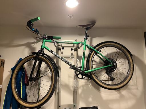
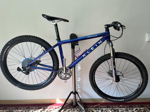
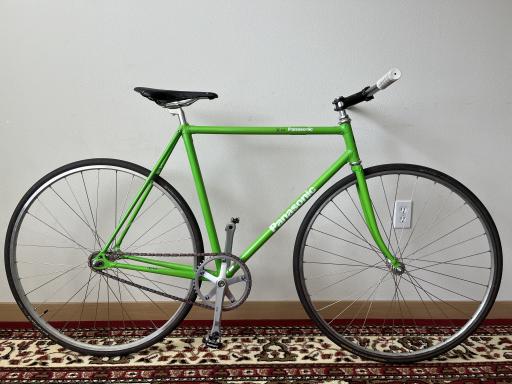
Drupal, Twig, UnoCSS
ID: mantra_starter:gallery
Status: experimental
| Name | Label | Type | Description |
|---|---|---|---|
images
|
Images | Slot |
ID: mantra_starter:heading
Heading element.
| Name | Label | Type | Description |
|---|---|---|---|
heading
|
Heading | Slot | |
heading_tag
|
Heading tag | Enum | Default: "span" Allowed values: span, h1, h2, h3, h4, h5, h6 |
heading_classes
|
Heading classes | Unknown | ⚠️ {"type":"array"} |
ID: mantra_starter:hero
Status: experimental
| Name | Label | Type | Description |
|---|---|---|---|
background_image
|
Background Image | Slot | |
content
|
Content | Slot | |
caption
|
Caption | Slot | |
title
|
Title | String | |
url
|
URL | String |
ID: mantra_starter:link
Link examples.
| Name | Label | Type | Description |
|---|---|---|---|
text
|
Text | String | |
url
|
Url | String | |
display
|
Display | Enum | Allowed values: link, hover, focus, active, visited |
ID: mantra_starter:list
Content list.
| Name | Label | Type | Description |
|---|---|---|---|
heading
|
Heading | Slot | |
items
|
Items | Slot |
ID: mantra_starter:list_header
Content list heading.
| Name | Label | Type | Description |
|---|---|---|---|
heading
|
Heading | Slot | |
heading_size
|
Heading size | Enum | Default: "normal" Required Allowed values: normal, large |
heading_tag
|
Heading tag | Enum | Default: "span" Allowed values: span, h2, h3, h4, h5, h6 |
ID: mantra_starter:list_items
Content list items.
| Name | Label | Type | Description |
|---|---|---|---|
items
|
Items | Slot | A list of renderables. An item that has children is instead a mapping of `value` and `below`, where `below` is a list of items of either shape -- it renders as a list of the same type inside the item's `li`. In a story such a mapping needs a `'#cache': {}` beside those keys to keep them. |
list_type
|
List type | Enum | Default: "ul" Allowed values: ol, ul |
line_height
|
Line height | Enum | Default: 1 Allowed values: 1, 2, 3 |
list_title
|
List title | String | |
column_width
|
Column width | String | Default: "auto" |
column_count
|
Column count | Enum | Default: "auto" Allowed values: auto, 2, 3, 4, 6, 8 |
code
ID: module_documentation:module-activity
A table of install, uninstall and update events.
Status: stable
| Name | Label | Type | Description |
|---|---|---|---|
rows
|
Rows | Links | Newest first. Required |
context_label
|
Context label | String | The header of an extra column, holding each row's context. No column without it. |
empty_text
|
Empty text | String |
| Date | Event | Version |
|---|---|---|
| Nothing has been recorded for this module since tracking started. | ||
| Date | Event | Version | Site |
|---|---|---|---|
| 2026-10-02 14:10 | Updated | 2.1.0 | Example site |
| 2026-06-18 09:42 | Updated | 2.0.3 | Example site |
| 2026-01-07 16:25 | Installed | 2.0.0 | Example site |
ID: module_documentation:module-configuration
The configuration that names a module in its dependencies, grouped by type.
Status: stable
| Name | Label | Type | Description |
|---|---|---|---|
groups
|
Groups | Links | One group per config entity type. Required |
indirect
|
Indirect | Number | How many more entities depend on the module only through these. Integers only |
Configuration that names this module in its own dependencies. Uninstalling the module removes or updates it.
3 further configuration entities depend on the module through these rather than naming it themselves.
No configuration declares a dependency on this module.
ID: module_documentation:module-info
The property table at the top of a module's page.
Status: stable
| Name | Label | Type | Description |
|---|---|---|---|
rows
|
Rows | Links | One row per property. A row has either a value or items. Required |
| Property | Value |
|---|---|
| Machine name | example_module |
| Version | 2.1.0 |
| Project page | |
| Dependencies |
|
ID: module_documentation:module-notes
The notes written about a module.
Status: stable
| Name | Label | Type | Description |
|---|---|---|---|
notes
|
Notes | Links | Required |
empty_text
|
Empty text | String |
From Release notes
No notes have been written about this module yet.
ID: mantra_starter:page_header
| Name | Label | Type | Description |
|---|---|---|---|
page
|
Page | Slot |
ID: mantra_starter:pager
Pager for views and other lists. Full and mini pagers, plus additional options. Includes features from these modules: - https://www.drupal.org/project/dc_pager - First/last page links as numbers in full pager - https://www.drupal.org/project/views_pager_mini_count - Page/results count in mini pager
Status: experimental
| Name | Label | Type | Description |
|---|---|---|---|
heading_id
|
Heading id | String | |
heading_level
|
Heading level | Enum | Level of the visually hidden "Pagination" heading, h1 to h6. Anything else, or nothing, is h4. Allowed values: h1, h2, h3, h4, h5, h6 |
current
|
Current page | Number | One-based current page, full variant only. The mini variant reads items.current instead, which is where the views mini pager puts it. Integers only |
ellipses
|
Ellipses | Unknown | ⚠️ {"type":"object"} |
first_last_numbers
|
First/last links as page numbers | Boolean | Full variant only. Puts previous and next outside first and last (previous, 1 … 20, next) rather than inside them as core does (first, previous … next, last). Set by the Mantra views pager. |
responsive
|
Controls on their own row on small screens | Boolean | Full variant only, on unless set to false. Below `md`, moves first, previous, next and last to a row above the page numbers. Default: true |
icons
|
Icons | Unknown | ⚠️ {"properties":{"previous":{"properties":{"pack_id":{"type":"string"},"icon_id":{"type":"string"},"settings":{"type":"object"}},"type":"object"},"next":{"properties":{"pack_id":{"type":"string"},"icon_id":{"type":"string"},"settings":{"type":"object"}},"type":"object"},"first":{"properties":{"pack_id":{"type":"string"},"icon_id":{"type":"string"},"settings":{"type":"object"}},"type":"object"},"last":{"properties":{"pack_id":{"type":"string"},"icon_id":{"type":"string"},"settings":{"type":"object"}},"type":"object"}},"type":"object"} |
icon_only
|
Icons only | Boolean | Show the icon of a link without its text. The visually hidden text ("Previous page") still names the link. Links without an icon keep their text. Default: false |
separators
|
Separators | Unknown | ⚠️ {"properties":{"count":{"type":"string"},"range":{"type":"string"},"range_total":{"type":"string"},"both":{"type":"string"}},"type":"object"} |
status_toggle
|
Show the page count and the results one at a time | Enum | Mini variant, with both items.total and items.range only. Instead of showing both where they fit, show one at a time, as a button switching to the other: "count" starts with the page count, "range" with the results. Empty, both are shown where they fit. Default: "" Allowed values: , count, range |
items
|
Items | Unknown | ⚠️ {"type":"object"} |
ID: mantra_starter:screenshot
Status: stable
| Name | Label | Type | Description |
|---|---|---|---|
image
|
Image | Slot |
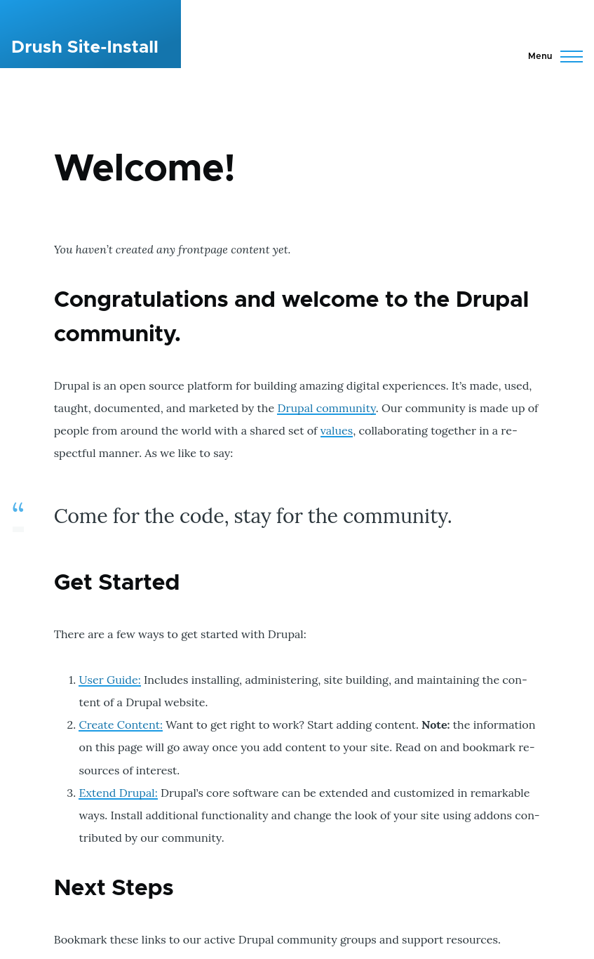
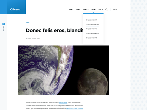
ID: mantra_starter:search_box
Status: experimental
| Name | Label | Type | Description |
|---|---|---|---|
label
|
Label | String | |
url
|
Url | String | |
key
|
Key | String |
ID: mantra_starter:swiper
Status: experimental
| Name | Label | Type | Description |
|---|---|---|---|
items
|
Items | Slot | |
label
|
Label | String | What the carousel shows. Names its region for assistive technology; a carousel without one is not a landmark. |
indicator
|
Indicator | Enum | What shows which slide is in view: a row of dots, one button per slide, or a scrollbar that can be dragged. Default: "dots" Allowed values: dots, scrollbar |
ID: mantra_starter:swiper_slide
Status: experimental
| Name | Label | Type | Description |
|---|---|---|---|
content
|
Content | Slot | |
label
|
Label | String |
ID: mantra_starter:table
A table that carries the theme's column width roles. A role is declared once, on the column, and the component puts it on the header cell and on every body cell in that column -- which is the part that is tedious by hand and easy to get wrong, because auto layout sizes a column from the widest content in it, so a role on the header alone leaves a long body cell free to widen the column anyway. The table is wrapped in the scroll container, so it keeps its natural width and scrolls sideways rather than having its columns crushed.
Status: experimental
| Name | Label | Type | Description |
|---|---|---|---|
caption
|
Caption | String | Names the table to a screen reader without needing a heading. |
sticky
|
Sticky header | Boolean | Holds the header at the top of the screen while the page scrolls past the table, and lets it go again at the last row. The table keeps its natural height and the page keeps its own scrollbar: the header is moved down the table by a script rather than stuck to a scroll box, so nothing about the table's layout changes when this is on. |
empty
|
Empty text | String | Shown as a single row when there are no rows. |
columns
|
Columns | Links | One entry per column, in order. `header` is the heading, `role` is the width role applied to the whole column. |
rows
|
Rows | Unknown | ⚠️ {"type":"array"} |
| Component | Machine name | Summary | Status | Stories | Operations |
|---|---|---|---|---|---|
| Card | card | An image, a heading and a short run of text, linked as a whole. | Experimental | 2 | Edit |
| Hero | hero | The first thing on a page: a heading, a paragraph and at most one call to action. | Experimental | 2 | Edit |
| Primary navigation | primary_nav | The menu of the site, which collapses into a toggle below the breakpoint. | Stable | 3 | Edit |
| Table | table | A table whose columns carry the theme's width roles. | Experimental | 4 | Edit |
| Component | Status | Operations |
|---|---|---|
| No components match the filter. | ||
| Component | Machine name | Status | Stories |
|---|---|---|---|
| Branding | branding | Stable | 1 |
| Button | button | Stable | 2 |
| Buttons demo | buttons_demo | Stable | 1 |
| Card | card | Experimental | 2 |
| Card grid | card_grid | Experimental | 2 |
| Content w/ sidebar | content_w_sidebar | Stable | 1 |
| Field | field | Stable | 1 |
| Gallery | gallery | Experimental | 1 |
| Heading | heading | Stable | 3 |
| Hero | hero | Experimental | 2 |
| Link | link | Stable | 4 |
| List | list | Stable | 1 |
| Menu | menu | Experimental | 2 |
| Pager | pager | Experimental | 2 |
| Primary nav | primary_nav | Stable | 3 |
| Reference | reference | Stable | 2 |
| Screenshot | screenshot | Stable | 1 |
| Search box | search_box | Experimental | 1 |
| Swiper | swiper | Experimental | 1 |
| Table | table | Experimental | 3 |
| Tabs | tabs | Experimental | 2 |
| Tag | tag | Stable | 1 |
| Component | Summary | Operations | ||
|---|---|---|---|---|
| ☐ | Card | An image, a heading and a short run of text, linked as a whole. | Edit | |
| ☐ | Hero | The first thing on a page: a heading, a paragraph and at most one call to action. | Edit | |
| ☐ | Primary navigation | The menu of the site, which collapses into a toggle below the breakpoint. | Edit |
ID: mantra_starter:tag
Status: stable
| Name | Label | Type | Description |
|---|---|---|---|
label
|
Label | Slot | |
tag
|
Tag | String |
ID: mantra_starter:reference
Internal label and resource link.
| Name | Label | Type | Description |
|---|---|---|---|
internal_label
|
Internal label | String | |
internal_url
|
Internal URL | String | |
reference_url
|
Reference URL | String | |
published
|
Published | Boolean |