Button
ID: mantra_starter:button
Buttons allow the user to take actions or make choices.
| Name | Label | Type | Description |
|---|---|---|---|
label
|
Label | Slot | |
size
|
Size | Enum | It is possible to set the size of buttons. Allowed values: small, medium, large |
display
|
Display | Enum | Block buttons fill the width of their container. Allowed values: inline-block, block |
url
|
URL | Url | The button URL. Optional. |
icon
|
Icon | Unknown | ⚠️ {"properties":{"pack_id":{"type":"string"},"icon_id":{"type":"string"},"settings":{"type":"object"}},"type":"object"} |
icon_position
|
Icon position | Enum | Default: "right" Allowed values: left, right |
Buttons demo
ID: mantra_starter:buttons_demo
List all buttons
| Name | Label | Type | Description |
|---|---|---|---|
buttons
|
Buttons | Slot |
Branding
ID: mantra_starter:branding
Site name, logo, slogan.
| Name | Label | Type | Description |
|---|---|---|---|
site_name
|
Site name | String | |
site_logo
|
Site logo | String | |
site_slogan
|
Site slogan | String |

Card
ID: mantra_starter:card
Status: experimental
| Name | Label | Type | Description |
|---|---|---|---|
image
|
Image | Slot | |
content
|
Content | Slot | |
caption
|
Caption | Slot | |
title
|
Title | String | |
url
|
URL | String | |
aspect
|
Aspect ratio | Enum | Allowed values: 1-1, 2-1, 3-1, 4-1, 3-2 |
max_width
|
Max width | Enum | Allowed values: xs, sm, md, lg, xl |
center
|
Center | Boolean | |
padding
|
Padding | Enum | Allowed values: 1, 2, 3, 4 |
padding_x
|
Padding x | Enum | Allowed values: 1, 2, 3, 4 |
padding_y
|
Padding y | Enum | Allowed values: 1, 2, 3, 4 |
border
|
Border | Enum | Allowed values: 1, 2, 3, 4 |
Card Grid
ID: mantra_starter:card_grid
Status: experimental
| Name | Label | Type | Description |
|---|---|---|---|
rows
|
Rows | Slot | |
title
|
Title | String | |
gap_x
|
Gap x | Enum | Allowed values: 1, 2, 3, 4 |
gap_y
|
Gap y | Enum | Allowed values: 1, 2, 3, 4 |
Content w/ sidebar
ID: mantra_starter:content_w_sidebar
Main column with a sidebar beside it. `meta` is the sidebar itself and `footer` sits under it; both fall below the content once there is no room for a second column.
| Name | Label | Type | Description |
|---|---|---|---|
content
|
Content | Slot | |
meta
|
Sidebar | Slot | |
footer
|
Sidebar footer | Slot |
Details
ID: mantra_starter:details
Dropdown details element.
| Name | Label | Type | Description |
|---|---|---|---|
summary
|
Summary | Slot | |
content
|
Content | Slot | |
open
|
Open | Boolean | |
collapsible
|
Collapsible | Boolean | |
unstyled
|
Unstyled | Boolean | |
details_classes
|
Details classes | List | Default: [] |
summary_classes
|
Summary classes | List | Default: [] |
summary_attributes
|
Summary attriubtes | Attributes | |
content_classes
|
Content classes | List | Default: [] |
content_attributes
|
Content attriubtes | Attributes |
Click me
Click me
Drupal logo
ID: mantra_starter:drupal_logo
Retro logo with color variables. Without a style, it follows the "Drupal logo" UI Skins theme selected in the theme settings.
| Name | Label | Type | Description |
|---|---|---|---|
accessories
|
Accessories | Slot | Printed inside the logo's `<svg>`, on top of everything else, in the logo's own coordinate space -- so it takes SVG, not HTML. This is where to put `mantra_starter:drupal_logo_hat` or `mantra_starter:drupal_logo_glasses` with props of their own, or any other `<svg>` element drawn against a `0 0 681.167 778.583` viewBox. |
style
|
Style | Enum | Default: "default" Allowed values: default, sunset, synthwave, rainbow-eyes, prism, candy-stripe, polka-dot, gold, night-sky, blueprint, ghost |
hat
|
Hat | Enum | A hat from `mantra_starter:drupal_logo_hat`, at its default placement and palette. Use the `accessories` slot instead to set its own props. Allowed values: , top_hat, party, santa, beanie, wizard, crown |
glasses
|
Glasses | Enum | Glasses from `mantra_starter:drupal_logo_glasses`, at their default placement and palette. Use the `accessories` slot instead to set their own props. Allowed values: , round, shades, heart, star, pixel, monocle |
Drupal logo glasses
ID: mantra_starter:drupal_logo_glasses
Glasses for `mantra_starter:drupal_logo`, drawn in the logo's own coordinate space so that they land over the drop's eyes with no placement of their own. Use them through the logo's `glasses` prop, or hand them to the logo's `accessories` slot to set the props below.
| Name | Label | Type | Description |
|---|---|---|---|
frame
|
Frame color | String | The rims, the bridge and the arms. Any CSS color. |
lens
|
Lens color | String | Transparent on every variant but the shades, so the logo's own eyes show through. A color with alpha tints them instead of hiding them. |
weight
|
Frame weight | Number | Logo units, of the 681 the logo is wide. 22 by default. |
x
|
Nudge across | Number | Logo units, of the 681 the logo is wide. Positive moves right. |
y
|
Nudge down | Number | Logo units, of the 778 the logo is tall. Positive moves down. |
rotate
|
Tilt | Number | Degrees, about the bridge. Negative tilts to the left. |
scale
|
Scale | Number | 1 is the size the glasses are drawn at. |
Drupal logo hat
ID: mantra_starter:drupal_logo_hat
A hat for `mantra_starter:drupal_logo`, drawn in the logo's own coordinate space so that it lands on the drop's head with no placement of its own. Use it through the logo's `hat` prop, or hand it to the logo's `accessories` slot to set the props below.
| Name | Label | Type | Description |
|---|---|---|---|
color
|
Color | String | The body of the hat: the crown, the cone, the band of the crown. Any CSS color. |
accent
|
Accent color | String | The trim: the hat band, the party stripes, the cuff of the bobble hat, the jewels of the crown. |
detail
|
Detail color | String | The small parts: the bobble, the stars on the wizard hat, the orbs of the crown. |
outline
|
Outline color | String | Drawn behind every shape, so it reads as an outline. Transparent by default on the hats whose body is dark enough not to need one. |
x
|
Nudge across | Number | Logo units, of the 681 the logo is wide. Positive moves right. |
y
|
Nudge down | Number | Logo units, of the 778 the logo is tall. Positive moves down. |
rotate
|
Tilt | Number | Degrees, about the middle of the hat band. Negative tilts to the left. -7 by default. |
scale
|
Scale | Number | 1 is the size the hat is drawn at. |
Field
ID: mantra_starter:field
Status: stable
| Name | Label | Type | Description |
|---|---|---|---|
body
|
Body | Slot | |
label
|
Label | String |
Gallery
ID: mantra_starter:gallery
Status: experimental
| Name | Label | Type | Description |
|---|---|---|---|
images
|
Images | Slot |
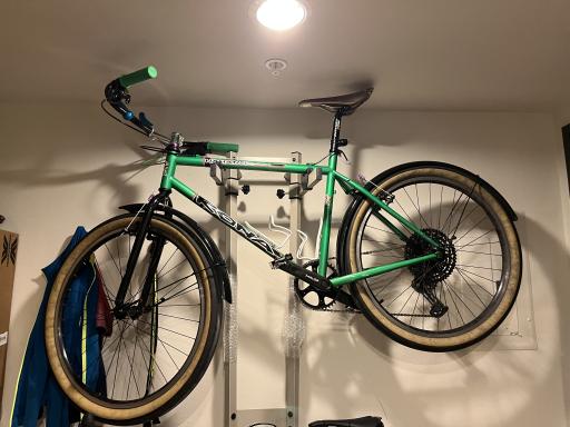
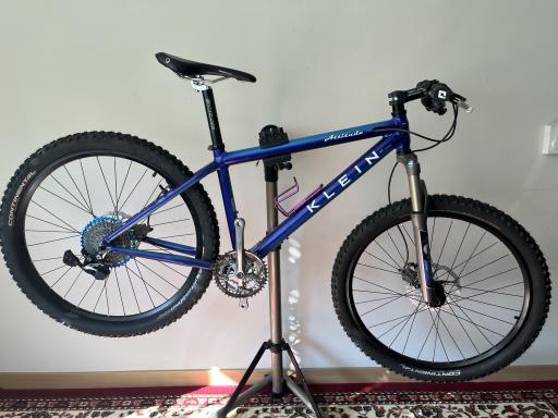
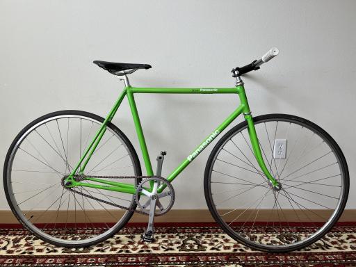
Heading
ID: mantra_starter:heading
| Name | Label | Type | Description |
|---|---|---|---|
heading
|
Heading | Slot | |
heading_tag
|
Heading tag | Enum | Default: "span" Allowed values: span, h1, h2, h3, h4, h5, h6 |
heading_classes
|
Heading classes | Unknown | ⚠️ {"type":"array"} |
A heading rendered as h3, sized by its classes
A heading rendered as h2
Hero
ID: mantra_starter:hero
Status: experimental
| Name | Label | Type | Description |
|---|---|---|---|
background_image
|
Background Image | Slot | |
content
|
Content | Slot | |
caption
|
Caption | Slot | |
title
|
Title | String | |
url
|
URL | String |
Built for the long way round
Frames, wheels and the parts that hold them together, chosen for roads that run out. See the bikes Klein Attitude, 1995Workshop hours
Tuesday to Saturday, nine until six. Repairs booked in by Thursday go out the same week.Link
ID: mantra_starter:link
Link examples.
| Name | Label | Type | Description |
|---|---|---|---|
text
|
Text | String | |
url
|
Url | String | |
display
|
Display | Enum | Allowed values: link, hover, focus, active, visited |
List
ID: mantra_starter:list
Content list.
| Name | Label | Type | Description |
|---|---|---|---|
heading
|
Heading | Slot | |
items
|
Items | Slot |
- one
- two
- three
- one
- two
- three
- Monday to Friday, 9am to 5pm
- Saturday, 10am to 4pm
- Closed Sunday
List heading
ID: mantra_starter:list_header
Content list heading.
| Name | Label | Type | Description |
|---|---|---|---|
heading
|
Heading | Slot | |
heading_size
|
Heading size | Enum | Default: "normal" Required Allowed values: normal, large |
heading_tag
|
Heading tag | Enum | Default: "span" Allowed values: span, h2, h3, h4, h5, h6 |
List items
ID: mantra_starter:list_items
Content list items.
| Name | Label | Type | Description |
|---|---|---|---|
items
|
Items | Slot | A list of renderables. An item that has children is instead a mapping of `value` and `below`, where `below` is a list of items of either shape -- it renders as a list of the same type inside the item's `li`. In a story such a mapping needs a `'#cache': {}` beside those keys to keep them. |
list_type
|
List type | Enum | Default: "ul" Allowed values: ol, ul |
line_height
|
Line height | Enum | Default: 1 Allowed values: 1, 2, 3 |
list_title
|
List title | String | |
column_width
|
Column width | String | Default: "auto" |
column_count
|
Column count | Enum | Default: "auto" Allowed values: auto, 2, 3, 4, 6, 8 |
- A link inside an item
- Markup an item may carry: strong, emphasis,
code - A component-styled span
- A plain string, for comparison
- one
- one a
- one b
- two
- three
- three a
- three a i
- three a
- one
- two
- three
- one
- one a
- one b
- one b i
- one b ii
- one c
- two
- three
- three a
- three b
- one
- two
- three
- one
- two
- three
- one
- two
- three
- Frame and forks
- Wheels and tyres
- Drivetrain
- Brakes and cables
- Bars, stem and seatpost
- Saddle
- Pedals
- Bags and racks
- one
- two
- three
- one
- two
- three
- four
- five
- six
- seven
- eight
- nine
- ten
- eleven
- twelve
- thirteen
- fourteen
- fifteen
- sixteen
- seventeen
- eighteen
- nineteen
- twenty
- Frame
- Steel
- Aluminium
- Titanium
- Wheels
- Rims
- Hubs
- Spokes
- Drivetrain
- Chainset
- Cassette
- Chain
- Brakes
- Rim
- Disc
- Saddle
- Pedals
- A frame built for touring carries its load low and behind the rider, which keeps the steering predictable when the bags are full.
- Gearing matters more than weight on a long climb, and a wide-range cassette costs less than the grams a lighter wheelset saves.
- Mudguards are the least glamorous upgrade and the one most likely to be thanked for by whoever is riding behind.
Page header
ID: mantra_starter:page_header
| Name | Label | Type | Description |
|---|---|---|---|
page
|
Page | Slot |
Pager
ID: mantra_starter:pager
Views pager.
Status: experimental
| Name | Label | Type | Description |
|---|---|---|---|
heading_id
|
Heading id | String | |
first
|
First | Unknown | ⚠️ {"type":"array"} |
last
|
Last | Unknown | ⚠️ {"type":"array"} |
items
|
Items | Unknown | ⚠️ {"type":"object"} |
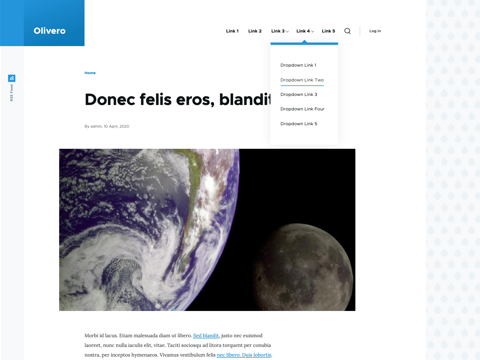
Screenshot
ID: mantra_starter:screenshot
Status: stable
| Name | Label | Type | Description |
|---|---|---|---|
image
|
Image | Slot |
Search Box
ID: mantra_starter:search_box
Status: experimental
| Name | Label | Type | Description |
|---|---|---|---|
label
|
Label | String | |
url
|
Url | String | |
key
|
Key | String |
Swiper
ID: mantra_starter:swiper
Status: experimental
| Name | Label | Type | Description |
|---|---|---|---|
items
|
Items | Slot | |
label
|
Label | String |
Swiper slide
ID: mantra_starter:swiper_slide
Status: experimental
| Name | Label | Type | Description |
|---|---|---|---|
content
|
Content | Slot | |
label
|
Label | String |
Table
ID: mantra_starter:table
A table that carries the theme's column width roles. A role is declared once, on the column, and the component puts it on the header cell and on every body cell in that column -- which is the part that is tedious by hand and easy to get wrong, because auto layout sizes a column from the widest content in it, so a role on the header alone leaves a long body cell free to widen the column anyway. The table is wrapped in the scroll container, so it keeps its natural width and scrolls sideways rather than having its columns crushed.
Status: experimental
| Name | Label | Type | Description |
|---|---|---|---|
caption
|
Caption | String | Names the table to a screen reader without needing a heading. |
sticky
|
Sticky header | Boolean | Holds the header at the top of the screen while the page scrolls past the table, and lets it go again at the last row. The table keeps its natural height and the page keeps its own scrollbar: the header is moved down the table by a script rather than stuck to a scroll box, so nothing about the table's layout changes when this is on. |
empty
|
Empty text | String | Shown as a single row when there are no rows. |
columns
|
Columns | Links | One entry per column, in order. `header` is the heading, `role` is the width role applied to the whole column. |
rows
|
Rows | Unknown | ⚠️ {"type":"array"} |
| Component | Machine name | Summary | Status | Stories | Operations |
|---|---|---|---|---|---|
| Card | card | An image, a heading and a short run of text, linked as a whole. | Experimental | 2 | Edit |
| Hero | hero | The first thing on a page: a heading, a paragraph and at most one call to action. | Experimental | 2 | Edit |
| Primary navigation | primary_nav | The menu of the site, which collapses into a toggle below the breakpoint. | Stable | 3 | Edit |
| Table | table | A table whose columns carry the theme's width roles. | Experimental | 4 | Edit |
| Component | Status | Operations |
|---|---|---|
| No components match the filter. | ||
| Component | Machine name | Status | Stories |
|---|---|---|---|
| Branding | branding | Stable | 1 |
| Button | button | Stable | 2 |
| Buttons demo | buttons_demo | Stable | 1 |
| Card | card | Experimental | 2 |
| Card grid | card_grid | Experimental | 2 |
| Content w/ sidebar | content_w_sidebar | Stable | 1 |
| Field | field | Stable | 1 |
| Gallery | gallery | Experimental | 1 |
| Heading | heading | Stable | 3 |
| Hero | hero | Experimental | 2 |
| Link | link | Stable | 4 |
| List | list | Stable | 1 |
| Menu | menu | Experimental | 2 |
| Pager | pager | Experimental | 2 |
| Primary nav | primary_nav | Stable | 3 |
| Reference | reference | Stable | 2 |
| Screenshot | screenshot | Stable | 1 |
| Search box | search_box | Experimental | 1 |
| Swiper | swiper | Experimental | 1 |
| Table | table | Experimental | 3 |
| Tabs | tabs | Experimental | 2 |
| Tag | tag | Stable | 1 |
| Component | Summary | Operations | ||
|---|---|---|---|---|
| ☐ | Card | An image, a heading and a short run of text, linked as a whole. | Edit | |
| ☐ | Hero | The first thing on a page: a heading, a paragraph and at most one call to action. | Edit | |
| ☐ | Primary navigation | The menu of the site, which collapses into a toggle below the breakpoint. | Edit |
Tag
ID: mantra_starter:tag
Status: stable
| Name | Label | Type | Description |
|---|---|---|---|
label
|
Label | Slot | |
tag
|
Tag | String |
Teaser
ID: mantra_starter:reference
Internal label and resource link.
| Name | Label | Type | Description |
|---|---|---|---|
internal_label
|
Internal label | String | |
internal_url
|
Internal URL | String | |
reference_url
|
Reference URL | String | |
published
|
Published | Boolean |